Saving time with GOV.UK design standards
While building the Civil Service People Survey (CSPS) site, ScraperWiki had to deal with the complexities of suppressing data to avoid privacy leaks and making technology to process tens of millions of rows in a fraction of a second.
We didn’t also have time to spend on basic web design. Luckily the Government’s Resources for designers, part of the Government Service Design Manual, saved us from having to.
In this blog post I talk through specific things where the standards saved us time and increased quality.
This is useful for managers – it’s important to know some details to avoid getting too distant from how projects really work. If you’re a developer or designer who’s about to make a site for the UK Government, there are lots of practical links!
Header and footer
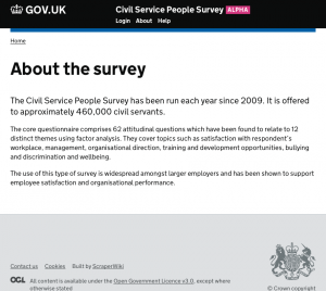
To style the header and the footer we used the govuk_template, via a mustache version which automatically updates itself from the original. This immediately looks good.
The look takes advantage of years old GDS work to be responsive, accessible and have considered typography. Without using the template we’d have made something useful, but ugly and inaccessible without extra budget for design work.
It also reduces maintenance. The templates are constantly updated, and every now and again we quickly update the copy of them that we include. This keeps our design up to date with the standard, fixes bugs, and ensures compatibility with new devices.
Buttons
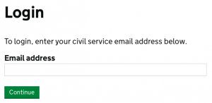
The template doesn’t have styling for your content. That’s over in a separate module called the govuk_frontend_template. It has a bunch of useful CSS and Javascript pieces. GOV.UK elements is a good guide to how to use them, with its live examples.
For example, there aren’t many forms and buttons in CSPS, nevertheless they look good.
The frontend template is full of useful tiny things, such as easily styling external links.
And making just the right alpha or beta banner.
The tools aren’t perfect. We would have liked slightly more styling to use inside the pages. Some inside Government are arguing for a comprehensive framework similar to Bootstrap.
All I really want is not to have to define my own <h1>!
Cookies
Privacy is important to users. Despite the flaws in the EU regulations on telling consumers about browser cookies, the goal of informing people how they are being tracked is really important.
Typically in a web project this would involve a bit of discussion over how and when to do so, and what it should look like. For us, it just magically came with the Government’s template.
I say magically, we also had to carefully note down all the cookies we use. A useful thing to do anyway!
Error messages
There are now lots of recently made Government digital services to poach bits of web design from.
The probate service has some interesting tabs and other navigation. The blood donation service dashboard has grey triangles to show data increased/decreased. The new digital marketplace has a complex search form with various styles.
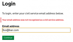
I can’t even remember where we took this error message format from – lots of places use it.
If you’d like to find more, doing a web search for site:service.gov.uk is a great way to start exploring.


