ScraperWiki scrapers: now 53% more useful!
It’s Christmas come early at ScraperWiki HQ as we deliver—like elves popping boxes under the data digging Christmas tree—a bunch of great new improvements to the ScraperWiki site. We’ve been working on these for a while, so it’s great to finally let you all use them!
First up: a new look for your scrapers
The most obvious change will hit you as soon as you look at a scraper – the overview page now sports a svelte, functional new layout. The roster of changes is as long as Santa’s list, so I’ll just pick out a few…
The blue header at the top of the page is now way more informative. As well as the scraper’s title and creator, you can also see the language it’s written in, the domain it scrapes, the number of records in its datastore, and its privacy status. No more hunting around the page: everything you need is there in one place. Hurrah!
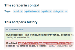
Further down, you’ll notice the history and discussion pages have now been merged into the main page, meaning you’ll spend less time flicking between tabs and more time editing or investigating the scraper.
Meanwhile, the page as a whole is a lot more organised. Everything to do with runs (the current status, the last run, the pages scraped, the schedule) is up in the top left. Everything to do with the datastore (including the data preview and download options) is just below that, and everything to do with the scraper’s relationship to other scrapers (like tags, forks, copies and views) is just below that. Neat.
Speaking of which, the data preview has had some serious attention. It’s now way more interactive: you can sort on any column, alter the number of rows displayed, and page through all of the data in all of the tables, with just a few clicks. And other features like syntax-highlighted table schemas and a nifty drop-down when you have too many tabs to fit on the page, should keep ScraperWiki power-users fast and efficient.
And those are just the headline changes. There have also been a load of great tweaks, like a View Source button so you never have to worry about breaking someone’s scraper when you’re just taking a look, and an easy Share button to get your scrapers on Facebook, Twitter and Google+. So go try out the new page, and as ever, we’d really love your feedback.
Never miss a comment again
As well as moving the scraper discussion (or ‘chat’, as it’s now called) onto the main page to make it more obvious, we’ve also enabled email notifications for comments. Now, when someone comments on your scraper, you’ll get a swish new email showing you who they are, what they said, and how to reply (thanks to ScraperWiki’s new engineer, David Jones, for his input on this!).
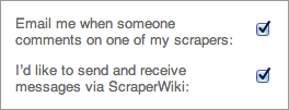
If, however, all this conversation is a little too much for you, Ebenezer, then you can disable comment notifications by unchecking the box in your Edit Profile page.
And while we were at it: Messages!
For a while, users have grumbled that it’s far too difficult to contact other users. And quite right too – we never anticipated that our developers would be such social creatures! So, we’ve added a “Send a Message” button to everyone’s profile (kudos to Chris Hannam for helping out!). The messages are sent as emails via feedback@scraperwiki.com, meaning the other user never sees your email address – just your name, your message and a link to your profile. And, as with comment notifications, if you want to disable sending and receiving of user messages, just uncheck the box in your Edit Profile page.


Awesome work, congratulations to the whole team on these great improvements!
As always though, I think you got the decimal point in the wrong place – surely you meant 530% more useful! 🙂