The UN peacekeeping mission contributions mostly baked
Many of the most promising webscraping projects are abandoned when they are half done. The author often doesn’t know it. “What do you want? I’ve fully scraped the data,” they say.
But it’s not good enough. You have to show what you can do with the data. This is always very hard work. There are no two ways about it. In this example I have definitely done it.
For those of you who are not so interested in the process, the completed work is here. And if you don’t think it’s done very well, come back and read what I have to say.
[By the way, the raw data is here, for you to download and — quote — “Do whatever you want with it.”]
Phase One: The scraping
At the Columbia event I was quite pleased to create a database of un_peacekeeping_statistics from a set of zip files of pdfs containing the monthly troop contributions to the various UN peacekeeping missions.
Each pdf document was around 40 pages and in a format like this:
This table says that during the month of January 2012 the government of Argentina sent 3 of its citizens to the United Nations Mission for the Referendum in Western Sahara, 741 people to the United Nations Stabilization Mission in Haiti, 265 to the United Nations Peacekeeping Force in Cyprus, and so forth.
I was very lucky with this: the format is utterly consistent because it is spat out of their database. I was able to complete it with about 160 lines of code.
After getting the code working, I cleaned it up by removing all the leftover print statements until the only thing that would be produced at runtime was a message when a new month became available in the database. The email generating code is on line 34 and it has so far worked once by sending me an email which looked like:
Subject: UN peacekeeping statistics for 2012-01
Dear friend,
There are 788 new records in the database for
https://scraperwiki.com/scrapers/un_peacekeeping_statistics/after month 2011-12 to month 2012-01
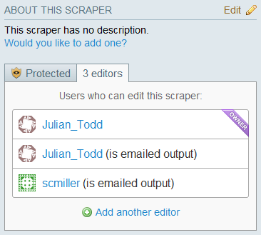
Who gets this email? Those who are listed as doing so in the editors list (see the image above). Maybe if you are a a journalist with international conflicts on your beat, you ought to get on this list. The emailer technology was outlined in an earlier blog-post. There is no UI for it, so it can only be enabled by request [send your request to feedback].
Phase Two: The analysis
What we have now is a table of over 86000 records stretching back to January 2003. The important columns in the table are:
month text,
country text,
mission text,
people integer
It turns out there are hundreds of relevant timeline graphs which you can make from this data with a little bit of SQL.
For example, what are the three top countries in terms of maximum deployment to any mission? Find it using:
SELECT country, max(people) as max_people
FROM swdata
GROUP BY country
ORDER BY max_people desc
LIMIT 3
The answer is India, Bangladesh and Pakistan.
To which missions do these three neighbouring, sometimes-at-war, rival countries predominantly send their troops?
Query this by executing:
SELECT mission, sum(people) as people_months
FROM swdata
WHERE country='India' or country='Bangladesh' or
      country='Pakistan'
GROUP BY mission
ORDER BY people_months desc
The answer is MONUC, UNMIL, UNMIS and UNOCI.
[The reporter who encouraged me to scrape this dataset had a theory that these peacekeeping missions are a clever way for nations to get their troops battle-hardened before the inevitable conflict on their own territory. In other words, they also serve as war-training missions.]
Now let’s have a look at the just the deployment of peacekeepers from India, Bangladesh and Pakistan to MONUC (United Nations Organization Mission in the Democratic Republic of the Congo) over time.
[There is no easy way to embed this google’s dynamic javascript timeline object into a blog, so I have to present a bitmap image, which is quite annoying.]

As you can see, the pattern of deployment tends to remain at a constant quota over many years, with sudden jumps, probably due to requirements on the ground. Pakistan appeared to supply both of these peacekeeping surges, once in 2003 and once in 2005, while Bangladesh surged at one and India surged at the other.
The picture for UNOCI (United Nations Operation in Côte d’Ivoire) is different:

There is none from India, but a fixed contingent between Bangladesh and Pakistan; 600 peacekeepers were swapped between them in August 2006.
The SQL code for producing these timeline graphs goes like this:
SELECT month||'-15',  # concatenate a day to make a valid format
    sum(people*(country='India')) as people_india,
    sum(people*(country='Bangladesh')) as people_bangladesh,
    sum(people*(country='Pakistan')) as people_pakistan,
    sum(people) as people_all FROM swdata
WHERE mission='UNOCI'
GROUP BY month
ORDER BY month
Now, you could ask who are the other countries which make up the bulk of this mission, and you could answer the question by developing the necessary SQL statement yourself, but it’s a little unfair to expect everyone who is interested in this data to already have mastered SQL, isn’t it?
Phase Three: Presentation
This is the very hard part, and is usually the point where most promising projects get abandoned, because “someone else better than me at design will come along and finish it.”
Except they never ever do.
As you’re really the only one in the world who comprehends the contents and the potential of this dataset, it is your job to prove it.
Here is my attempt at a user interface for generating graphs of the queries that people might be interested in. It has taken me two hard hacking sessions to get it into this form — or twice as long as it took to write the original scraper.
It is almost as time-consuming as producing video marketing.
This is also usually the phase where all those design geniuses come out of the woodwork and start getting critical and disparaging of your efforts, so you can’t blame programmers who don’t go this far. It’s like sweating all month learning to play a new piece of music on the piano, only to get reminded again and again that you don’t have the talent.
This used to bug me big time. Until I realized that it’s actually a positive sign.
What’s infinitely worse than criticism is no criticism at all because nobody has any idea about you are trying to achieve.
Now they think they know what you are trying to do — which is why they can be critical.
The next step is for them to actually know what you are trying to do. This ought to be a small step — and if they can’t make it, and don’t even try to make it, then by definition they cannot very good designers at all.
Look, you have just got all this way starting from nothing, from finding something out in the world, to recognizing its potential, all the way to pulling in and transforming the original raw data and struggling for a way to analyse it. It’s like you have prospected for the diamonds, found them in the earth, cut a mine tunnel to it with your bare hands, separated it from the rock, roughed out its edges, glued it onto a steel washer for a ring, and oh, it doesn’t look very professional and polished now does it? Come on, give us a break! We’ve applied bags of essential skills which hardly anyone else is capable of, so why should we expect to be especially good at this phase? Does your horse have table manners? No. But it works for its hay doesn’t it?
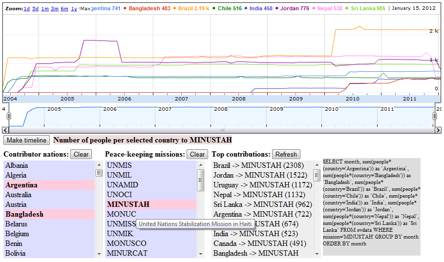
So anyway, here is what the current result looks like:
[Question: Does the Nepalese deployment react to events that were reported in the news during the course of the Haiti mission?]
When the page initializes there are three ajax call-backs to the database to obtain the lists of countries, missions, and top contributions from countries to specific missions. You can multiple select from the countries and the missions lists to create timeline graphs of numbers of people. If you select only from the countries list it shows the troop contributions from those countries to all UN missions. If you additionally select a single mission as well it will graph those country contributions to that specific mission. And it works the other way, vice versa, for lists of missions v countries. The top contributors table helps identify who are the top countries (or missions), so you know which ones to select to make an interesting graph that is not all zeros. (eg no point in graphing the number of Italians deployed to Nepal, because there aren’t any.)
Where do the Italians go? You can find that out by selecting “Italy” from the “Contributor nations” column and clicking on the “Refresh” button on the “Top contributions” column. And you can also click on “Make timeline” to discover that Italy never sent anyone anywhere until late 2006, when they suddenly started deploying two to three thousand peacekeepers to Lebanon. What happened then? Did something change in Italian politics around that point? Maybe people who write Italian newspapers ought to know.
Okay, the user interface is not great, but it achieves the objective of facilitating the formulation of relevant questions, and answering them — which is more than can be said of a lot of artistic user interfaces that crop up around the place, like so many empty bottles of wine.
Phase four: Publishing and promoting
There is no point in doing all this work if the people who would be interested never get to see it.
This bit I cannot do at all, so I don’t even try. I do know that throwing up a long rambling technical blog about the project does not constitute effective publication. In fact, according to the news rules, “once it’s told, it’s old”, so I have just completely ruined everything, because it can now never get onto the New York Times or The Guardian on their data blog section for its 15 hours of fame, before being lost into the past archive where no one is interested at all while it steadily goes out of date through the coming months and years.
Except this dataset, with the infrastructure behind is different, because it remains in date for the foreseeable future. So it really ought to have a home somewhere, like those stock market indicators, ever present on the business pages, like the daily crossword or cartoon.
Who knows how to get this done? It’s not my bag and I am quite exhausted.
What I do know is that I had to keep looking up what all those acronyms mean until I decided I should copy them down in the code and use them for tool-tips. It took quite a bit of work, and was repetitive, and maybe should have been scraped from somewhere. But was probably extremely well worth doing, so I am repeating it here.
missiontips = { UNMIS:"United Nations Missions in Sudan", UNMIL:"United Nations Mission in Liberia",
  UNAMID:"African Union/United Nations Hybrid operation in Darfur", UNOCI:"United Nations Operation in Côte d'Ivoire",
  MINUSTAH:"United Nations Stabilization Mission in Haiti", MONUC:"United Nations Organization Mission in the Democratic Republic of the Congo",
  UNMISS:"United Nations Mission in the Republic of South Sudan", UNMIK:"United Nations Interim Administration Mission in Kosovo",
  MONUSCO:"United Nations Organization Stabilization Mission in the Democratic Republic of the Congo",
  MINURCAT:"United Nations Mission in the Central African Republic and Chad",
  ONUCI:"Opération des Nations Unies en Côte d'Ivoire", UNMEE:"United Nations Mission in Ethiopia and Eritrea",
  ONUB:"United Nations Operation in Burundi", UNIFIL:"United Nations Interim Force in Lebanon",
  UNMIT:"United Nations Integrated Mission in Timor-Leste", UNMISET:"United Nations Mission of Support in East Timor",
  UNAMSIL:"United Nations Mission in Sierra Leone", MINURSO:"United Nations Mission for the Referendum in Western Sahara",
  UNOMIG:"United Nations Observer Mission in Georgia", UNMIN:"United Nations Mission in Nepal",
  UNAMA:"United Nations Assistance Mission in Afghanistan", UNIKOM:"United Nations Iraq-Kuwait Observation Mission",
  UNFICYP:"United Nations Peacekeeping Force in Cyprus", UNISFA:"United Nations Interim Security Force for Abyei",
  UNTSO:"United Nations Truce Supervision Organization", UNOTIL:"United Nations Office in East Timor",
  MINUCI:"United Nations Mission in Côte d'Ivoire", UNIOSIL:"United Nations Integrated Office in Sierra Leone",
  BINUB:"Bureau Intégré des Nations Unies au Burundi", UNAMI:"United Nations Assistance Mission for Iraq",
  UNDOF:"United Nations Disengagement Observer Force", UNMOGIP:"United Nations Military Observer Group in India and Pakistan",
  binub:"Bureau Intégré des Nations Unies au Burundi", BNUB:"United Nations Office in Burundi",
  UNMA:"United Nations Mission in Angola" };
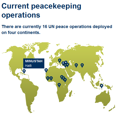
I’ll sign off with an image of what normally stands for an interactive index to the list of missions on the official UN website, and imagine I have done enough for someone to take it on from here.


Hi, this is really great, thanks for doing this. I am not nearly as capable with scraping, so I was wondering if you had tips on how I could scrape UN data on fatalities in peacekeeping missions? The link I’ve found for pdfs is here: http://www.un.org/en/peacekeeping/resources/statistics/fatalities.shtml
Thank you again.