Inordinately fond of beetles… reloaded!
 Some time ago, in the era before I joined ScraperWiki I had a play with the Science Museums object catalogue. You can see my previous blog post here. It was at a time when I was relatively inexperienced with the Python programming language and had no access to Tableau, the visualisation software. It’s a piece of work I like to talk about when meeting customers since it’s interesting and I don’t need to worry about commercial confidentiality.
The title comes from a quote by J.B.S. Haldane, who was asked what his studies in biology had told him about the Creator. His response was that, if He existed then he was “inordinately fond of beetles”.
The Science Museum catalogue comprises three CSV files containing information on objects, media and events. I’m going to focus on the object catalogue since it’s the biggest one by a large margin – 255,000 objects in a 137MB file. Each object has an ID number which often encodes the year in which the object was added to the collection; a title, some description, it often has an “item name” which is a description of the type of object, there is sometimes information on the date made, the maker, measurements and whether it represents part or all of an object. Finally, the objects are labelled according to which collection they come from and which broad group in that collection, the catalogue contains objects from the Science Museum, Nation Railway Museum and National Media Museum collections.
The problem with most of these fields is that they don’t appear to come from a controlled vocabulary.
Dusting off my 3 year old code I was pleased to discover that the SQL I had written to upload the CSV files into a database worked almost first time, bar a little character encoding. The Python code I’d used to clean the data, do some geocoding, analysis and visualisation was not in such a happy state. Or rather, having looked at it I was not in such a happy state. I appeared to have paid no attention to PEP-8, the Python style guide, no source control, no testing and I was clearly confused as to how to save a dictionary (I pickled it).
In the first iteration I eyeballed the data as a table and identified a whole bunch of stuff I thought I needed to tidy up. This time around I loaded everything into Tableau and visualised everything I could – typically as bar charts. This revealed that my previous clean up efforts were probably not necessary since the things I was tidying impacted a relatively small number of items. I needed to repeat the geocoding I had done. I used geocoding to clean up the place of manufacture field, which was encoded inconsistently. Using the Google API via a Python library I could normalise the place names and get their locations as latitude – longitude pairs to plot on a map. I also made sure I had a link back to the original place name description.
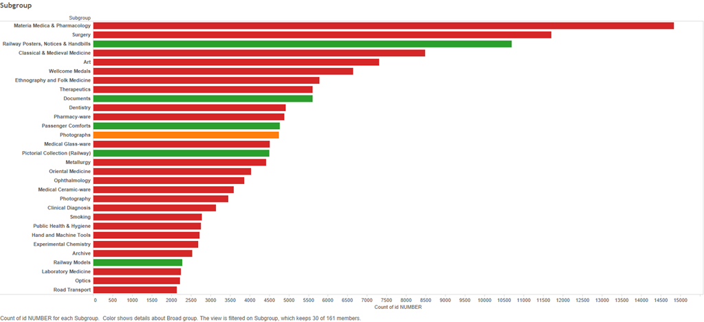
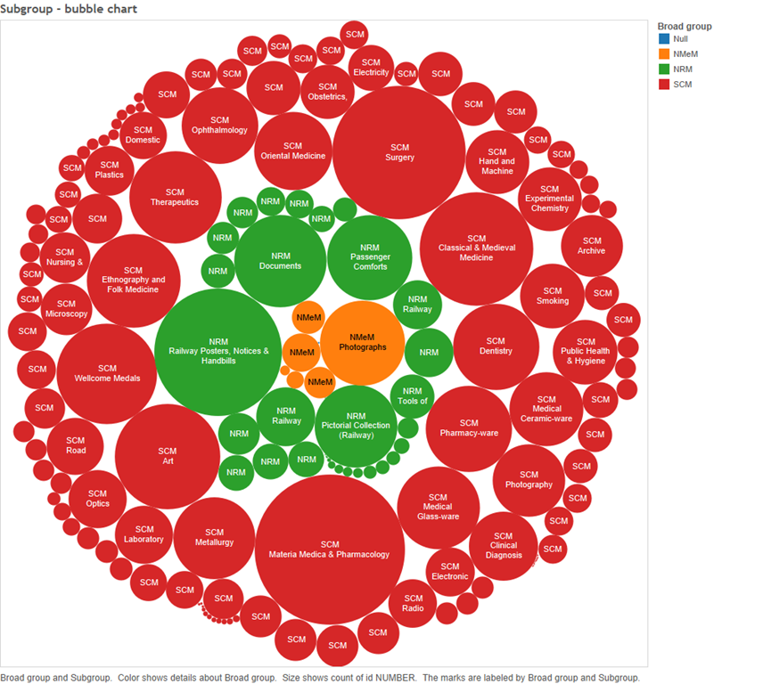
The first time around I was excited to discover the Many Eyes implementation of bubble charts, this time I now realise bubble charts are not so useful. As you can see below in these charts showing the number of items in each subgroup. In a sorted bar chart it is very obvious which subgroup is most common and the relative sizes of the subgroup. I’ve coloured the bars by the major collection to which they belong. Red is the Science Museum, Green is the National Rail Museum and Orange is the National Media Museum.
Less discerning members of ScraperWiki still liked the bubble charts.
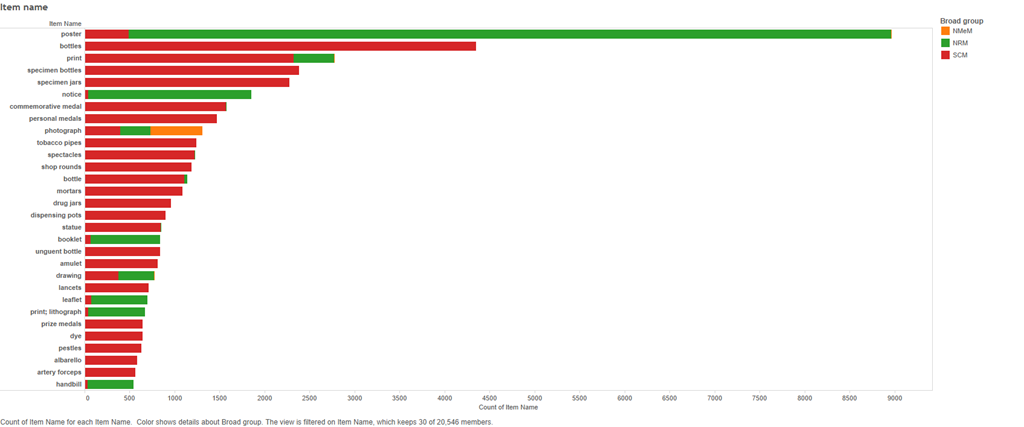
We can see what’s in all these collections from the item name field. This is where we discover that the Science Museum is inordinately fond of bottles. The most common items in the collection are posters, mainly from the National Rail Museum but after that there are bottles, specimen bottles, specimen jars, shops rounds (also bottles), bottle, drug jars, and albarellos (also bottles). This is no doubt because bottles are typically made of durable materials like glass and ceramics, and they have been ubiquitous in many milieu, and they may contain many and various interesting things.
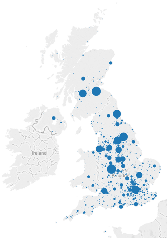
Finally I plotted the place made for objects in the collection, this works by grouping objects by location and then finding latitude and longitude for those group location. I then plot a disk sized by the number of items originating at that location. I filtered out items whose place made was simply “England” or “London” since these made enormous blobs that dominated the map.
You can see a live version of these visualisation, and more on Tableau Public.
It’s an interesting pattern that my first action on uploading any data like this to Tableau is to do bar chart frequency plots for each column in the data, this could probably be automated.
In summary, the Science Museum is full of bottles and posters, Tableau wins for initial visualisations of a large and complex dataset.

