Take a Look at This
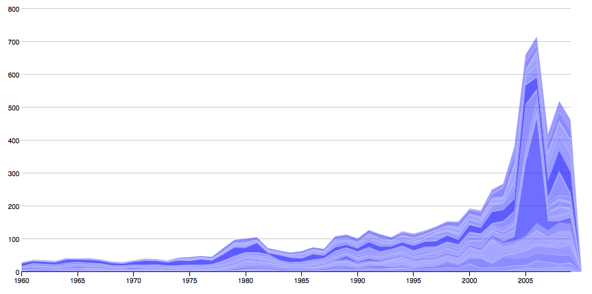
Here at ScraperWiki we’re not just about scraping but also about viewing the work you’ve scraped. In this case, ‘The Julian’, didn’t even scrape! He got it from The Guardian Data Blog. They posted an animated history of UK aid 1960-2009 mapped. Spanish design house Bestiaro produced it using OECD aid data. All ‘The Julian’ had to do was download the data and get playing with Protoviz to see what he could conjure up. And here it is. The Y-axis ia £M. So you can see the changing total amount but also the change in proportions of that amount each country receives.
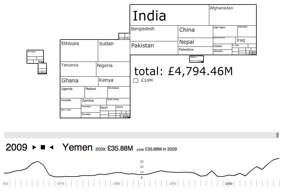
The original looks like so, with time bar and country click isolation.
 The main port of information is the treemap in which you can drill down to the individual countries. ‘The Julian’ turned this on it’s head by putting all the data onto the graph (I think it looks much prettier!). Here, the amount is the thickness of the line so you can see how it adds up to the totals in time and which country gets the largest proportion for each moment in time. Here is the UK aid flow:
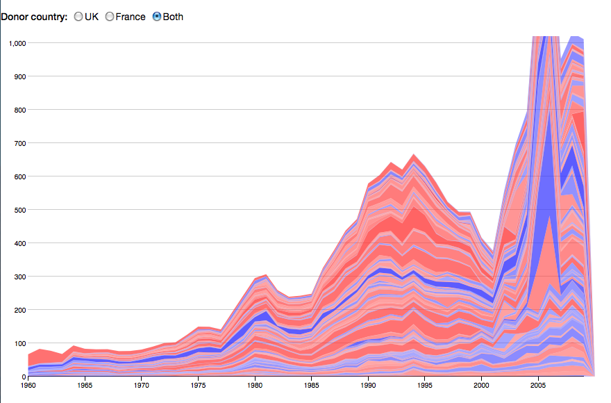
 Check out which counties are what line on the original. What this type of visualization allows over the Bestario one is to compare the aid being given by different countries (rather than to). The view at the top is aid given by both the UK and France, the french aid appearing in red. So the visual is then leaning towards finding out about the givers and not just the receivers. As you can see quite easily by which colour is more predominant. This more geographical map shows how data can be spun along different angles.
Here at ScraperWiki we’re all about finding the different angles to the data!

