With Tools, Tables and Tours: We’re Looking to Liberate Data Across the US
 As part of the Knight News Challenge entry, we at ScraperWiki said we would roll out Journalism Data Camps across the U.S. We had done what we called “Hacks and Hackers Hack Day” events across the U.K. and Ireland, bringing journalists and coders together. This happened at the same time as HacksHackers in the U.S. — great minds and whatnot!
Now we’re scaling up when it comes to exploring the data prospects of the new world. We are heading across the U.S. on a data liberation front. But where do we start, and where do we go? Well, firstly we want to liberate data. And lots and lots of people can use data. More importantly, we want to bring together anyone who wants to work with data to tell a story, provide insight or build an application.
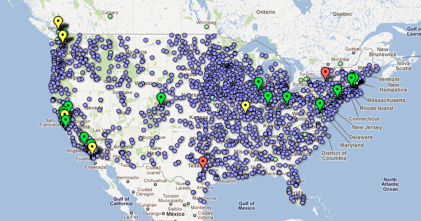
So how do you go about finding where the right mixes are? Well, I scraped the data, mapped it, and visualized it, of course! I scraped media organizations, R, Ruby, Python, and PHP meetup groups, data conferences, some B2B media as well as HacksHackers Chapters, and the top journalism schools. All in all, almost 13,000 data points were collected from different scrapers. So I put them into Google Fusion Tables and voila! (Please click on the image to be taken to the map)
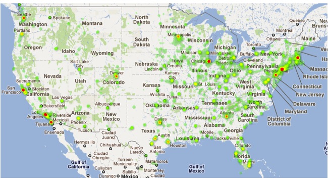
A heat map gives me the hotspots for the concentrations of data points. These are biased towards the media sector, as there are many more outlets than interest groups and journalism schools. But it’s a good gauge of where we can build interest for the events.
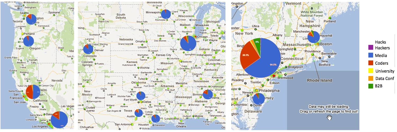
Drilling down through the data using filter and aggregate, I got the breakdown of the proportion of the groups we want to reach for each locale. With some rough and ready image manipulation (I use Gimp as it’s open source), I mashed up a visualization scaling the pie charts so that the pixel radius corresponds to the size of the dataset for that location.
Now, it’s not an exact science nor is it news site-ready. But the speed in which I can look for a guide from data is now set to the digital time clock. 13,000 data points collected, cleaned and visualized in half a day. This is now a loose guide but also a tool. And this is the sort of quick thinking, quick gathering and quick analyzing we want to see at our events. So think big data. Think multiple sources. Think multiple tools. And then you can extrapolate for multiple uses!
We haven’t settled on our tour locations yet, so watch this space for details. We’re also getting clues for where to go from the data underground, so don’t think the data is giving everything away. We hope to see you there!


