Fine set of graphs at the Office of National Statistics
It’s difficult to keep up. I’ve just noticed a set of interesting interactive graphs over at the Office of National Statistics (UK).
If the world is about people, then the most fundamental dataset of all must be: Where are the people? And: What stage of life are they living through?
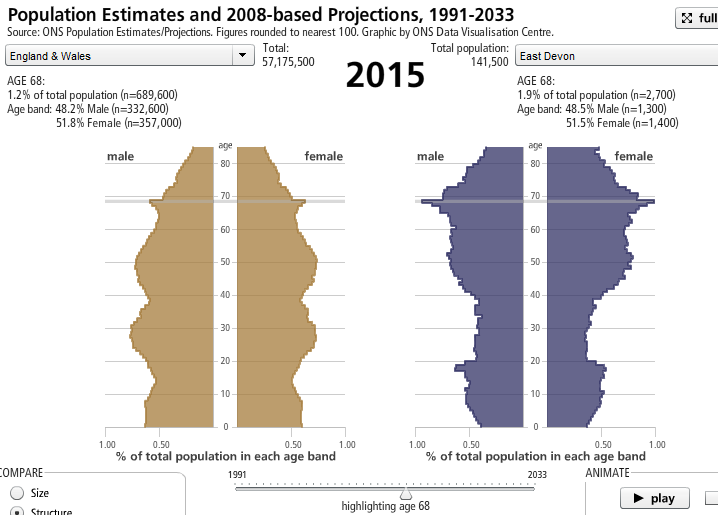
A Population Pyramid is a straightforward way to visualize the data, like so:
This image is sufficient for determining what needs to be supplied (eg more children means more schools and toy-shops), but it doesn’t explain why.
The “why?” and “what’s going on?” questions are much more interesting, but are pretty much guesswork because they refer to layers in the data that you cannot see. For example, the number of people in East Devon of a particular age is the sum of those who have moved into the area at various times, minus those who have moved away (temporarily or permanently), plus those who were already there and have grown older but not yet died. For any bulge, you don’t know which layer it belongs to.
In this 2015 population pyramid there are bulges at 28, 50 and a pronounced spike at 68, as well as dips at 14 and 38. In terms of birth years, these correspond to 1987, 1965 and 1947 (spike), and dips at 2001 and 1977.
You can pretend they correspond to recessions, economic boom times and second wave feminism, but the 1947 post-war spike when a mass of men-folk were demobilized from the military is a pretty clean signal.
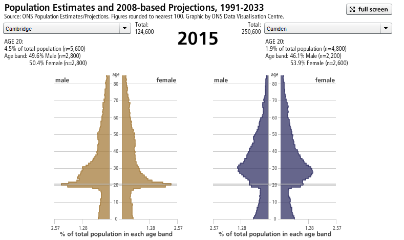
What makes this data presentation especially lovely is that it is localized, so you can see the population pyramid per city:
Cambridge, as everyone knows, is a university town, which explains the persistent spike at the age 20.
And, while it looks like there is gender equality for 20 year old university students, there is a pretty hefty male lump up to the age of 30 — possibly corresponding folks doing higher degrees. Is this because fewer men are leaving town at the appropriate age to become productive members of society, or is there an influx of foreign grad students from places where there is less of a gender equality? The data set of student origins and enrollments would give you the story.
As to the pyramid on the right hand side, I have no idea what is going on in Camden to account for that bulge in 30 year olds. What is obvious, though, is that the bulge in infants must be related. In fact, almost all the children between the ages of 0 and 16 years will have corresponding parents higher up the same pyramid. Also, there is likely to be a pairwise cross-gender correspondence between individuals of the same generation living together.
These internal links, external data connections, sub-cohorts and new questions raised the more you look at it means that it is impossible to create a single all-purpose visualization application that could serve all of these. We can wonder as to whether an interface which worked via javascript-generated SQL calls (rather than flash and server-side queries) would have enabled someone with the right skills to roll their own queries and, for example, immediately find out which city and age group has the greatest gender disparity, and whether all spikes at the 20-year-old age bracket can be accounted for by universities.
For more, see An overview of ONS’s population statistics.
As it is, someone is going to have to download/scrape, parse and load at least one year of source data into a data hub of their choice in order to query this (we’ve started on 2010’s figures here on ScraperWiki – take a look). Once that’s done, you’d be able to sort the cities by the greatest ratio between number of 20 year olds and number of 16 year olds, because that’s a good signal of student influx.
I don’t have time to get onto the Population projection models, where it really gets interesting. There you have all the clever calculations based on guestimates of migration, mortality and fertility.
What I would really like to see are these calculations done live and interactively, as well as combined with economic data. Is the state pension system going to go bankrupt because of the “baby boomers”? Who knows? I know someone who doesn’t know: someone who’s opinion does not rely (even indirectly) on something approaching a dynamic data calculation. I mean, if the difference between solvency and bankruptcy is within the margin of error in the estimate of fertility rate, or 0.2% in the tax base, then that’s not what I’d call bankrupt. You can only find this out by tinkering with the inputs with an element of curiosity.
Privatized pensions ought to be put into the model as well, to give them the macro-economic context that no pension adviser I’ve ever known seems capable of understanding. I mean, it’s evident that the stock market (in which private pensions invest) does happen to yield a finite quantity of profit each year. Ergo it can support a finite number of pension plans. So a national policy which demands more such pension plans than this finite number is inevitably going to leave people hungry.
Always keep in mind the long term vision of data and governance. In the future it will all come together like transport planning, or the procurement of adequate rocket fuel to launch a satellite into orbit; a matter of measurements and predictable consequences. Then governance will be a science, like chemistry, or the prediction of earthquakes.
But don’t forget: we can’t do anything without first getting the raw data into a usable format. Dave McKee’s started on 2010’s data here … fancy helping out?


