Summarising Serendipity
5 years ago, a friend and I sat down in a pub in Shrewsbury, drank some beer, and chatted about the web. Every month since, people have been doing that in Shrewsbury (and a few times in Ludlow). It’s called ShropGeek (we’re very savvy in our naming conventions, you see). It was started and organised almost exclusively via twitter, and it has evolved from a monthly banter-session into an annual conference.
I say this here not as an advertisement (cough), but because I have almost accidentally ended up as a co-organiser of quite a big event. (It’s an accident, on my part, because Kirsty has put a hell of a lot of time and effort into it!)
Because of its twitter-heavy organisation, I would have a pretty good idea about what was going on, because @shropgeek would normally be included in conversations. With the nature of the beast evolving, I’ve had some pretty important questions about how people share, and what they’re saying about the conference, and I accidentally (I seem accident-prone when it comes to administrative tasks) discovered a very useful resource which sits under my nose at my day-job: the Summarise Automatically tool on the New ScraperWiki.
 One of the first things I did, to test out the summariser was to search twitter for mentions of the “#revolutionconf” hashtag, then click on “summarise this data.” My expectations were to see some cool graphics, and mainly to test it out as a ScraperWiki tool. What I found, though, were some really valuable views on how people are tweeting.
Basically, the summariser tool tries to tell you some instant things about your data by, well, summarising the columns in your data. This can be a bit of a mixed bag, with some summaries making little sense (but we’ll get better at that). However, the really cool thing is the very high-level, dashboard-like information I could get on *this* data, which I know comprises tweets, and all of which are related to my hashtag.
 1. The first win was a simple count of how many mentions there are. I saw that the hashtag hasn’t been used as much as it could be (with only 66 instances), and realised that I’ve tweeted several times without it. /me slaps own hand!
2. Next, for me, was the screen_name summary. I saw several people on that list who I didn’t realise were in-the-know, and was able to remind myself to thank them soon!
3. The pie-chart saying other hashtags was also interesting, because it included the word “#excited”. Although this doesn’t seem to have *every* other hashtag, it was good to see.
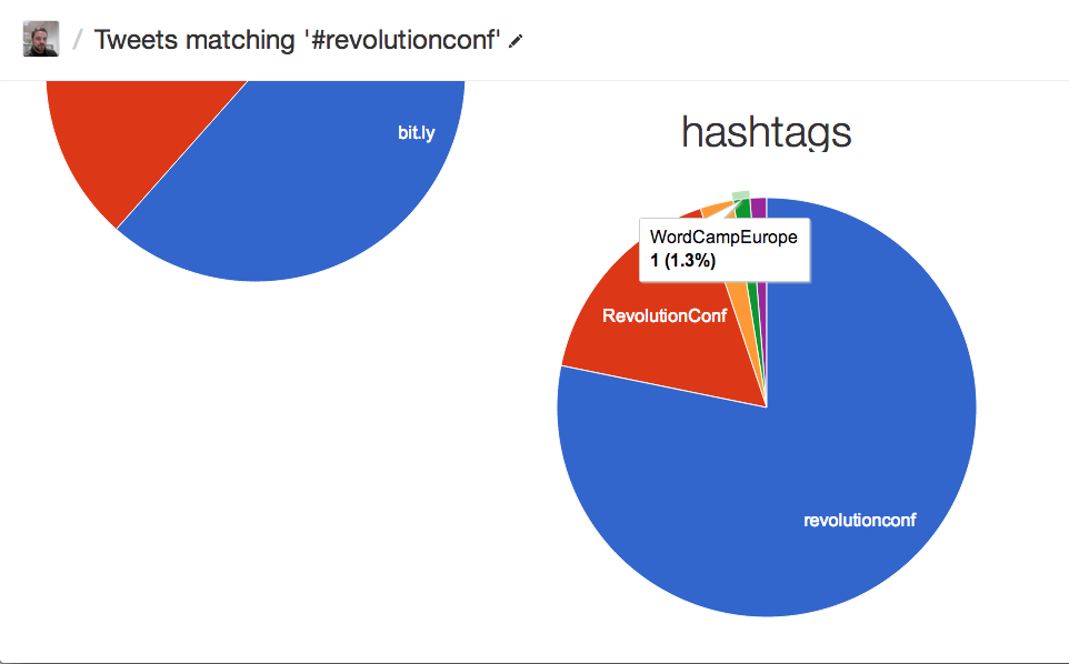
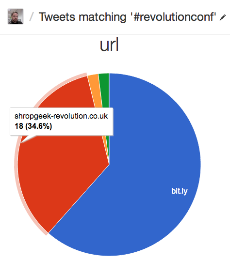
4. Finally, “url” column was summarised as a pie-chart, showing me which urls were included within tweets containing the conference hashtag. This is very interesting, because I can see if people are linking to the index page, or to the ticket page for the site. Also, I can see what *isn’t* being linked (e.g. the Lanyrd page for the event or direct to eventbrite, which I expected to happen.)
 These were all interesting, and helped me instantly better understand how people are talking about the conference. I should also point out that the tool ran automatically: all I did was to install the tool on my search data, and it presents me with this information without any setup. Best of all, it also showed me some things I wasn’t planning for. The list of re-tweeters, for example, jogged my memory, and made me consider asking some specific people to mention the event, which is something I hadn’t thought of doing.
I’m pretty excited about this tool, not just because it’s geeky and has charts, but because it’s at a very early stage and *already* did something useful with my social data. As it improves, I hope we get some more instant-win effects from it, and I’d be keen to hear what we could do to make it better, too.