Summarise #2: Pies and facts
In a previous blog post, I showed how by counting the most common values in each column (like a pivot table, or “group by” in SQL), I managed to make a tool that can automatically summarise datasets.
I quickly realised that there were better ways of visualising the data than just showing tables. For example, if there are only a few possible values for a column, it makes better sense as a pie chart.
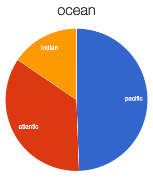
For example, these are the oceans from the Climate Code Foundation’s sea-level station data (the same dataset that appeared in the last blog post).
After playing with a few datasets, and with David’s help, we found that the pies are useful when there are more than two but fewer than eight values.
The code that makes the pie chart is in the “fact_groups_pie” function in the facts.js file. I’m calling each possible visualisation a “fact”. There’s a bunch of code in the “add_fact” function in code.js which, for each possible fact, decides which has the highest priority, and shows that one for each column. For example, a pie chart (if there are few enough values) overrides a table.
The pie is made using Google charts (code in charts.js) – I deliberately wanted to keep things simple for this tool. Because the visualisations are automatically chosen, it didn’t feel right to hand craft them in D3.
You can play too! If you are part of the Beta, you can use the “Summarise automatically” tool yourself now on your own dataset. Either upload a spreadsheet with the “Upload spreadsheet” tool, or use the “Twitter search tool” or one of the coding tools to get some data you care about into ScraperWiki. Then choose “Summarise automatically” from the tools menu and see what surprises there are.
You’ll probably see one of the visualisation type I haven’t talked about yet. Next time – all about showing time and numbers using buckets…
Trackbacks/Pingbacks
[…] ← Summarise #2: Pies and facts […]
[…] the last two weeks I introduced the “Summarise automatically tool”, which magically shows you […]
[…] been teasing and tempting you with blog posts about the first few tools on the new ScraperWiki Beta for a while now. […]
[…] explained in Summarise #2: Pies and facts, the summarise tool generates lots of different “facts” about the data. It then has a […]